Belle&Co. is my personal lifestyle brand that umbrellas industries such as homeware, cosmetics and travel accessories.
I wanted to brand the company delicately with elegant and feminine elements that reflect who I am. The brand mark uses Kastangel font as I wanted to keep on trend typography that fit the brand purpose. The colour scheme is neutral and warm and can be flexible depending on product colour concept.
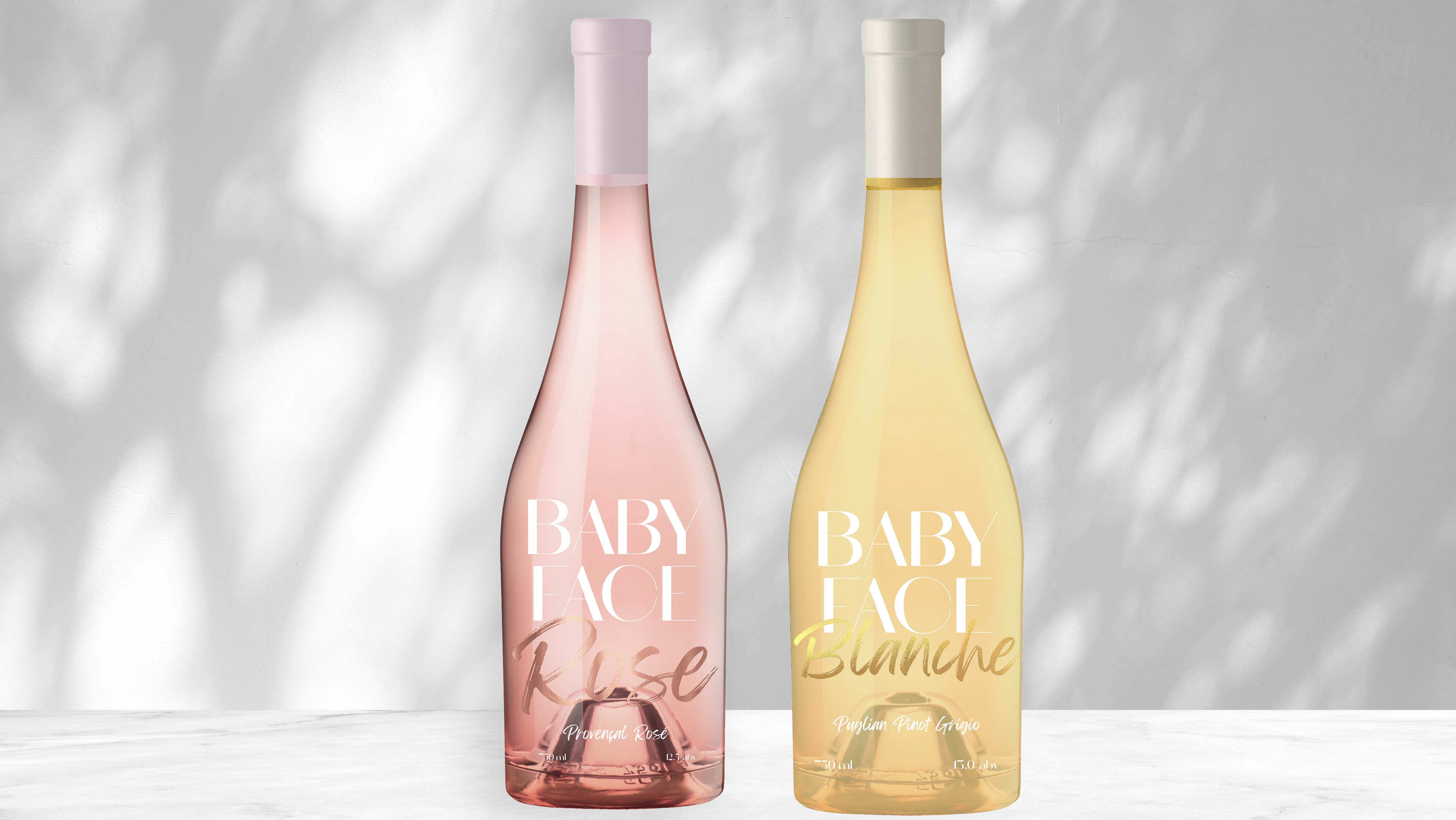
Above are candle product mockups that I designed for prospective lines i'd like to release, whilst below is a skincare item. Packaging design is something I enjoy thoroughly so this was a great chance to develop my skills. I wanted the packaging to be interchangeable depending on product, but recognisable as a collection belonging to the main brand. Brand mark is clear on all packaging which is vital to succesful branding and typography is sans serif to contrast but remain legible. The colour palette I chose is not only fitting to the individual product, but works well to represent the femininity of the brand as a whole.
Mockups all sourced from Behance.
