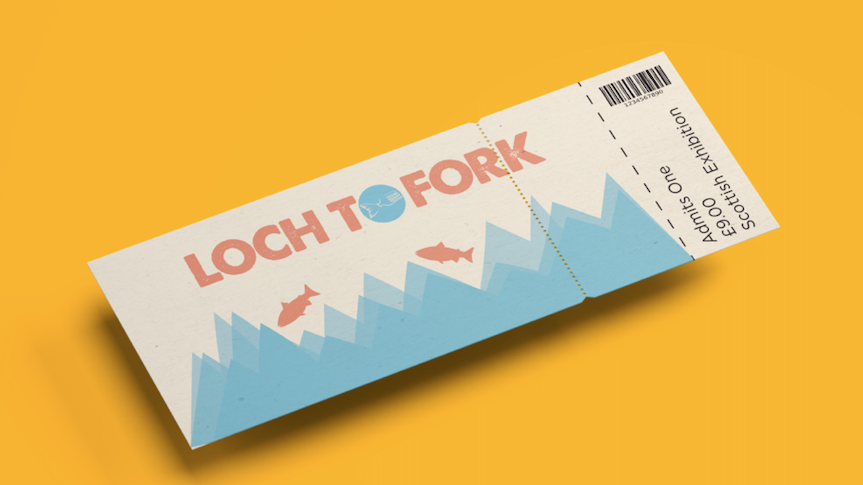
In my 2nd year, I rebranded a social event of my choice and designed them a website to share information about it. Choosing the London Seafood Festival, I went for a muted navy as the key colour and hand drew illustrations that strongly communicated the ocean theme. I made use of bold imagery as this is key to communicating brand values, and its easier for the user to understand the purpose of the website. My favourite feature was using illustration as it was a personal touch to the website and it was practise to improve the skill for later projects.
Mockups from Behance.
